Modernism
In the field of art the broad movement in Western art, architecture and design which self-consciously rejected the past as a model for the art of the present. Hence the term modernist or modern art. Modernism gathered pace from about 1850. Modernism proposes new forms of art on the grounds that these are more appropriate to the present time. It is thus characterised by constant innovation. But modern art has often been driven too by various social and political agendas. These were often utopian, and modernism was in general associated with ideal visions of human life and society and a belief in progress. The terms modernism and modern art are generally used to describe the succession of art movements that critics and historians have identified since the Realism of Courbet, culminating in abstract art and its developments up to the 1960s. By that time modernism had become a dominant idea of art, and a particularly narrow theory of modernist painting had been formulated by the highly influential American critic Clement Greenberg. A reaction then took place which was quickly identified as Postmodernism. |
(definition from tate glossary)
Five images of what I consider to be modernist Graphic Design.

Beck, Harry, (1933) 'London Underground Map', http://www.europeanunionmaps.com/tag/london-map/
Using simple block colour within the new layout for the design for the london underground is an example of modernist design, the layout comes across as quite simple yet very aesthetically pleasing.

The serif typography used within the image is a definite link to modernism, a new way of working.

http://swisslegacy.octavez.com/uploads/2009/09/3867846859_b495612f01_o1.jpg
This is a design for a german match box company, the simplistic design with minimal colours suits the miniature format perfectly.

Peter Saville, (1983) Blue Monday, http://www.bbc.co.uk/collective/dnaimages/030606/saville_bluemonday.jpg
This is the best selling 12" ever made, maybe a move into post modernism however the experimental simple minimalistic design going against traditional styles of working keeps it very modern, going against form follows function this band lost 30p for ever copy of this record sold due to the expensive production of the design.

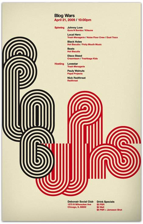
Poster for night, http://28.media.tumblr.com/WDfkCINtuqs5m87oTIndAeHbo1_500.jpg
At a quick glance it is hard to see what the poster is trying to communicate, it is only when you look at the poster in detail you can work out the message, which i feel definitely goes against 'form follows function', using elaborate swirls and maybe the poster more image driven rather than communicating a message.
No comments:
Post a Comment